Research phase
As told on the last entrance , from Nespresso HQ we noticed that our established procedure for the launching of a new machine was not optimal at all, Therefore, the UX team wanted to find a better way to do this improving both users and stakeholders experience with it. In this project, I’m going to show you the results for the PDP page display for the new machine launch.
The issue with our promotion method was mainly 2; From the customer side, the landing pages receive less and less interaction and conversion, and from the stakeholder’s point of view every time we needed to create a landing page that required significant hours budget from several departments, that it didn’t convert much then it didn’t make a lot of sense investing this budget on this.
Our hypothesis was that, if we would have a better PDP page we wouldn’t have the need to develop this kind of page. We also thought that the “awareness” factor (over the conversion rate) this landing page can pursue, was already accomplished with the rest of campaign done outside the eCommerce (commercials, emailing, boutique promotion…) that was one of the main concerns holding back some stakeholders.
So, after having collected the results from the latest machine landing page launched, we proposed a new version for the machines PDP template.
Since this time we were talking about a template rethinking, we wanted to make sure this versión would fulfil better both the stakeholders and users needs, so we decided to launch some surveys and interviews to make sure we had everyone’s needs in mind.
From the user test, one of the most important learning we extracted was the top priorities of our users for what needed to be displayed in a machine PDP;
1- Customer ratings
2- Design (pictures and specs)
3- Best value for money
Those were the most important things for them, then in a second level it would come:
- Coffee preparations I will be able to prepare with this machine
- Dimensions
- Demo videos
And then, in the third level of importance, and just as a “nice to have, but not essential” we would find these other content categories: - Free coffee taste gift
- Machine weight
- Milk system for the machine
That user insights were very important to us, but we have to mix and balance them with the stakeholder’s needs, and the technical constraints we would face.
We extracted from those interviews that ratings and reviews were definitely a must. We also learnt that something that was very important was missing, it was the “good design feeling”, users were seeing nice designs on the products but not on the product page.
Another interesting finding was to know that the price is important, but the quality-price balance was much more important and didn’t mind spending a bit more if it was worth it, rather than just purchasing the cheapest one.
Those were the most commonly raised topic by our interviewed users, however, some particulars raised some interesting point of view that, despite not being a common feeling, were interesting enough to have them in consideration. For instance, the fact of having user pictures at the ratings and reviews was making those reviews more credible and interesting. This was noted as a future improvement, since by the time it’s not technically feasible, and not all markets agree with this functionality since they want to have all the control of the images provided (to make sure they’re perfect) so we’ll develop it as an optional feature to suit each market’s needs.
Some users also found our texts to be composed by too large paragraphs, that’s indeed something we’ve also been worried about, and users would much better prefer those text to be summarized in bullet points, so they can quickly scan and decide whether or not the time they spend reading it would be useful for their needs or not.
And last but not least, some users commented with us the help that would be provided if they had some sort of a comparator, and that’s also we’ve been previously discussing about too, and the fact that some users are asking for this gives us more reasons to find the time budget for research and development of this more complex feature.
Design
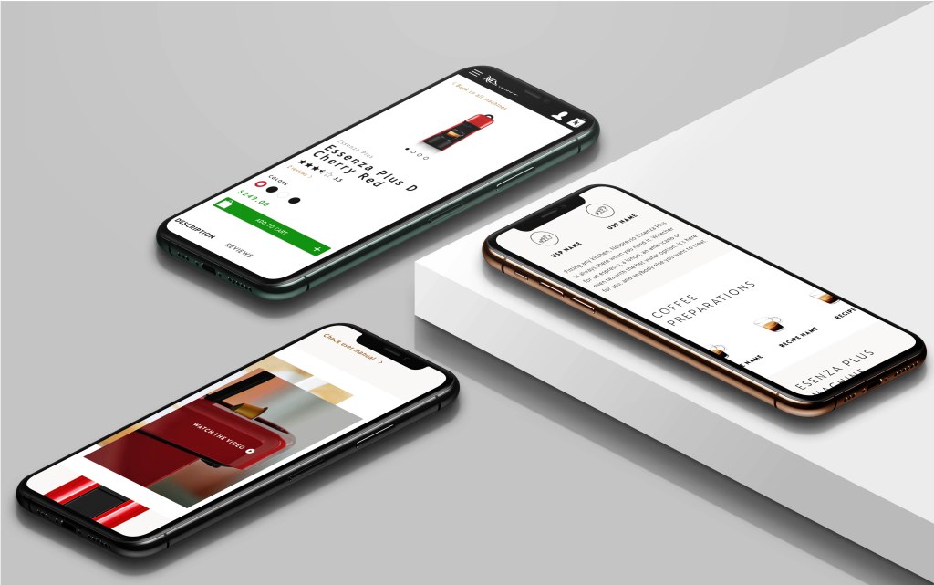
What we have first done is a Little rearrangement of the hierarchy in the product summary that the users first sees, compressing and rearranging the order.

In a second term, we have divided the main content between the product description and the reviews, this way we give the users the opportunity to decide whether they want to receive the first information from the Brand or directly from other users.

What we have also tried to do with this PDP it to offer more information (at all levels) than it was offered before, but making sure every bit of it was necessary and was contributing to the machine acknowledgement. Our scroll rate at the previous landing pages was not very encouraging since one of the problems we were facing is that there was way too much scroll, so we have tried to condense all vital information in the less space possible.
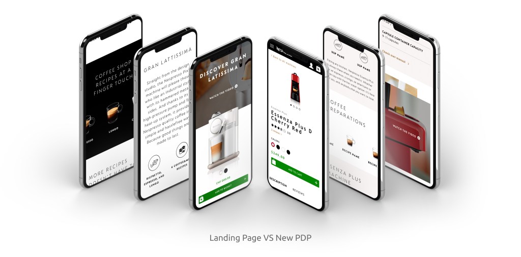
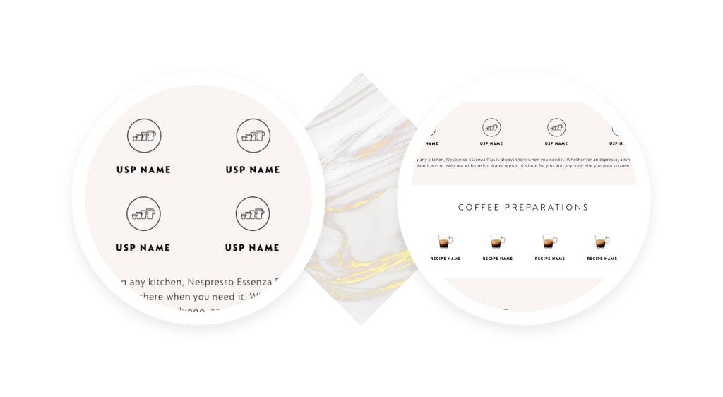
The first capsule of content after the product summary is a list of USPs, telling the users what makes this product unique and different from the other ones offered, so they can quickly scan it and decide if it’d suit their needs and, therefore, invest their time continue reading, or passing to the next one.
Then we’d find the “what” capsule, what are the users going to get if they decide to have this product; in this scenario, we’re showing them which coffee extractions to spect from the machine featured.
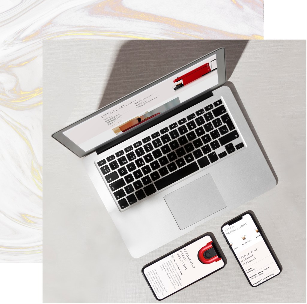
After that, we’d provide the users with some technical specifications, since we find that, if they have already scrolled through this third section they must have a true interest awaken inside of then, and therefore it’d be the perfect moment to show them this kind of information. Just in the time they’d like to have it.
Once the user has scrolled all the main features and content, it’d be the time to introduce some storytelling and “brand magic” this would be the perfect time to show the users a video; if they have arrived at this point, would mean they are interested in spending some of their time on this page, so a video intis stage wouldn’t be seen as a loose of time, but a nice way to finish understanding the product.

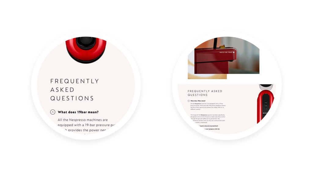
And after all the product main specificities have been presented, it’d be the time to answer some specific doubts the user might have, so we’re offering our users the FAQ section as a way to finish our product PDP since this section would only be of interest if the user is truly considering the purchase of the product.
Validation
Once the page was released, we had the opportunity to properly tag everything we were interested to analyze in google analytics, and as our hypothesis said, this “enriched” PDP page format improved the metrics significantly:
Bounce rate: 40%*
Number of views: 3,30*
Time spent: 5:33*
Scroll depth: 80%*
*All numbers shown are fictional due to privacy policy.
