During the re-styling work of CorreYvuela’s web , one of the main usability problems that I encountered was its incorrect adaptation from mobile to desktop. It is right to think of mobile first for a company like CorreYvuela, the product of which works mainly in mobile phones. However, they often used the “mobile first” imperative to end up degenerating the “mobile only” which generated clear problems of usability of the web in desktop format. If we start with the header, everything was correct except for the location of the language selector, which was originally located in the footer, with the corresponding problems of negative user experience that this entails (if the user is from a foreign country and not he understands Spanish, the main language, he will try to change the language of the website as soon as possible: if he does not find this option quickly he will close the page in a few seconds, without even scrolling). Therefore, it must occupy a hierarchically relevant position.

As for the main content, which is seen at a glance without having to scroll, it should be revised and redefined. This was a very difficult task since the PO defended the design of this first view of the web, so that mainly aesthetic changes and slight changes in content could be made. Beginning with the main copy, the semantic content of this one was too long and unnecessarily redundant, so different versions of reduction were proposed. being too long and being stylistically the same, it was monotonous, boring and endless, so it needed a visual hierarchy that would help to understand the content through divisions of semantic content, and give it a hierarchy of relevance through uses of different bodies of source. The mobile version was well adjusted, but the desktop version was as if it were out of whack and wasted a lot of space that could be occupied by the content off-hook correctly.

A small gif was added to the header in the mobile version, which added a nod of dynamism. In mobile version this gif becomes static due to the on-screen display of the gif of the phone, so it would be excessive visual input the animation of 2 elements.
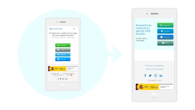
The colors and proportions of the platform buttons were modified so that they would not be so dissonant with each other and would fit with the aesthetics of the web, always maintaining the corresponding corporate color.
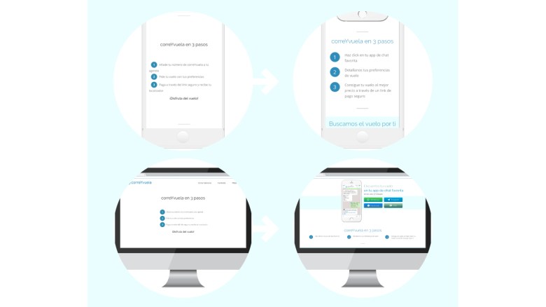
The section “correYvuela in 3 steps” was pretty well resolved for mobile version, it only had to be fixed some layout errors in mobile version, which made it look like the website was broken. As for the desktop version we were facing another case of neglect of this version becoming noticeable that it was a mobile recycling: disproportionately large letters and waste of space for not adapting the design to horizontal. It was simply a matter of reorganizing the elements so that they would occupy much less space and could be understood much better if we take into account the desktop environment. In mobile we keep the same.

The sections follow each other in a monotonous and equal way, all sections were the same. This excessive homogeneity generates confusion when it comes to identifying contents by visual units, so that when doing a quick scroll all the sections are put together and the web does not generate interest in being carefully consulted. We must make it easy for users to understand at a glance what content belongs to which section and what these contents mean. It required a clearer hierarchy and a graphic distinction that encouraged to consult the contents. This case gradually becomes more obvious as the scroll progresses, and it is when you get to the “Why use correYvuela” section when you started to get sick of the monotony of the contents, so this should be avoided and we should motivate the user to scroll through rethinking copys and above all, stylistic reissue.

The testimonies section was quite well resolved, there was only one thing to improve orderered by the company: to make more evident what text corresponds to each image making some kind of arrow. So the comments were framed in sandwiches to the left of the person’s avatar.

Mobile press section was well understandable, but again the problem came when it was applied to desktop version without any proper adaptation, so a different design was proposed, one that worked well in both mobile and desktop. There was also a problem with the slideshow of media logos in which they mentioned correYvuela. The first problem is that by not having any title or definition, it was not understood that they where doing those logos there, so they required a signifier. Another clear problem was the excessive prominence that was given to each of them: the appearance in individual order and the excessive time of this appearance together with the excessive time of blank space between them. So a continued slider was proposed under the subtitle of “They also talk about correYvuelA”
As I have already mentioned, one of the main problems that the footer had was to contain the language in such an unimportant position. Another problem presented was its contextual menu that had the same hierarchical and visual place as the copyright phrase. As they are different things, they must be seen differently and they must be differentiated. So the contextual menu was reduced and differentiated from the rest of the elements, reordering them and giving each of them a proper entity within the footer.
 Sara's portfolio